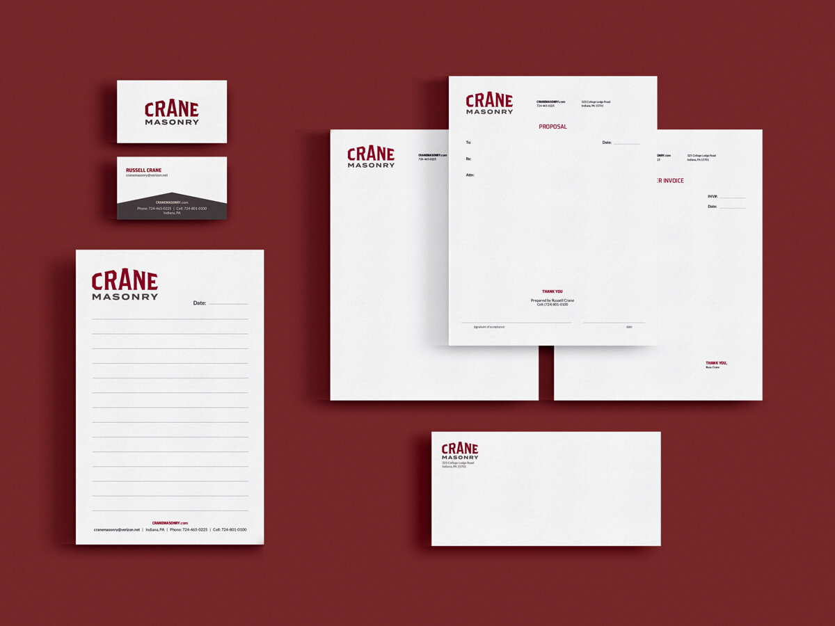
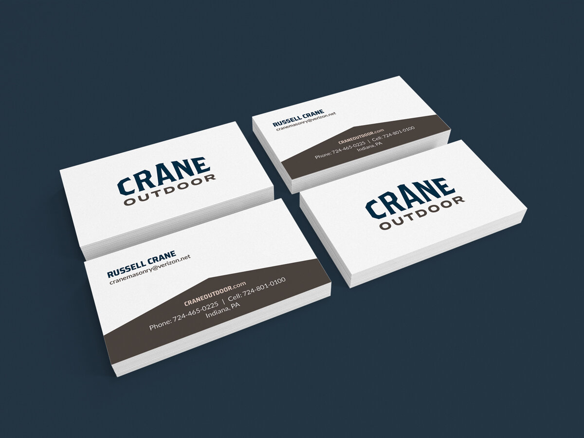
Crane Masonry and Crane Outdoor Rebrand
The owner of Crane Masonry and Crane Outdoor was looking to make his businesses more cohesive with a rebrand. We decided to treat Crane as the main brand and each business as an extension. The constant logo but interchangeable line for the business will build brand recognition for each company separately while building association with each other because of the main mark recognition. Based off of the images he sent me and our discovery session, I pitched three initial logos.
The option we went with is a clean, symmetric word mark that hints at masonry with the letters pitching to give it a church or roof feel as a nod to the main business, while not including any obvious masonry shapes, which makes it usable for both businesses. The bold font creates a clean, legible, and recognizable word mark.