Ajax Concrete Brand
Ajax Concrete is a start-up concrete business that needed a brand to establish itself.
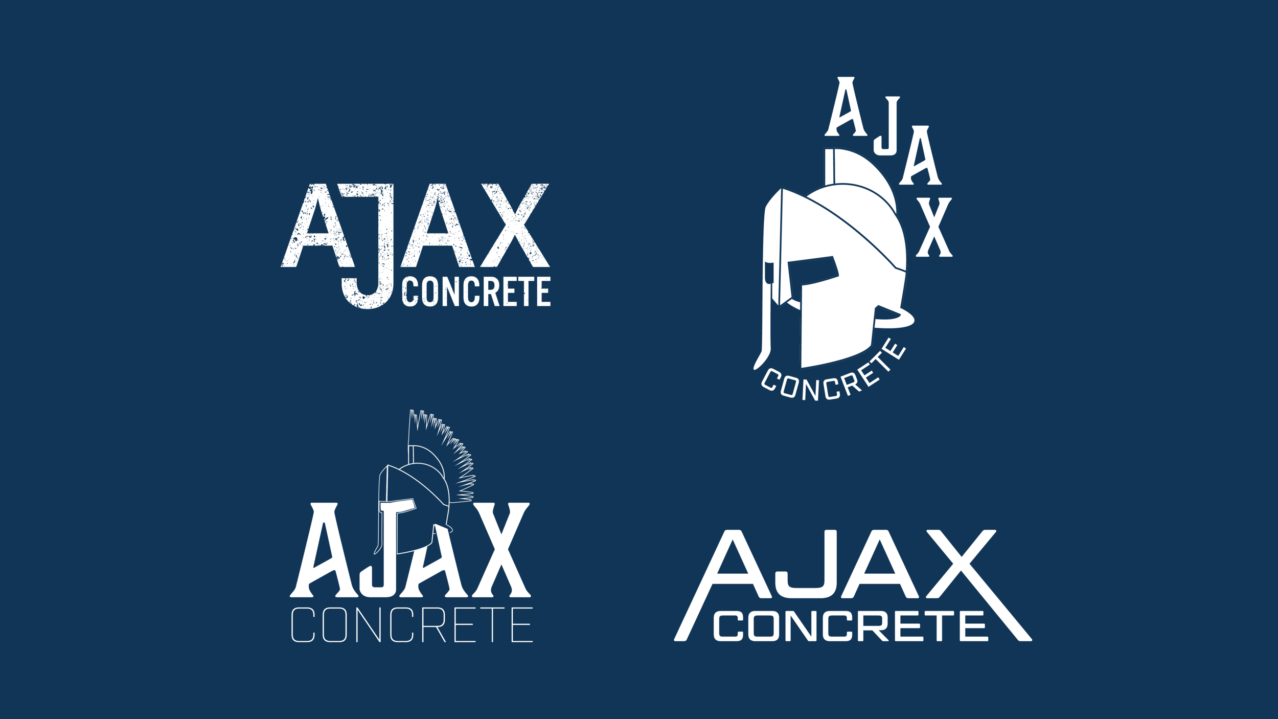
We explored a few different directions for the logo to take. The owner of Ajax Concrete originally thought he wanted to incorporate a spartan helmet for the brand.
The option we went with was a clean wordmark with an accentuated J to not only fill the whitespace efficiently but also highlight the letter as a nod to the owner’s first name, Jacob. A concrete texture was applied over the letters to roughen it up and make it feel more gritty. Concrete is in all caps with a high x-height for legibility but inline with the J to add balance.